My projects

PAGE OF AN ITALIAN RESTAURANT'S MENU
GIF of the functional drop-down menu Footer and end of the website

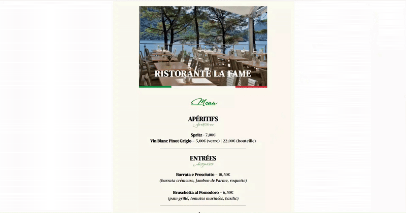
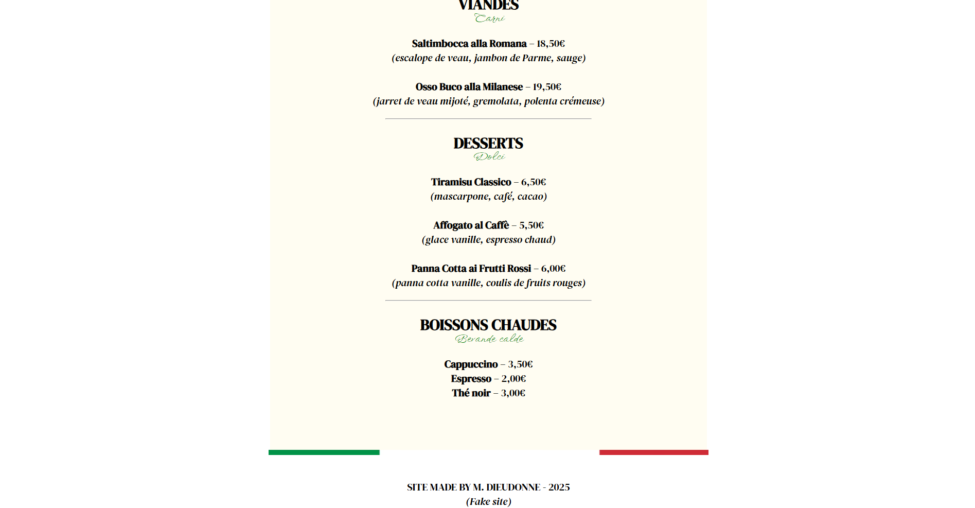
Coding languages and softwares: HTML, CSS, and Krita for
picture editing, coded on Phoenix Code
Realization time: 6h
Realization date: 2025

Pictures: Photo of a copyright-free restaurant, Italian flag
Fonts: DM Serif Display and Windsong, for a more sophisticated look, on Google Fonts
Color palettes: The Italian flag's green (red would create too much contrast) and beige to make the vintage menu stand out
Interactive elements: Drop-down menu

Problems encountered: I struggled to make white columns appear on the sides. After research, I could center the text's body.
What I like: I am satisfied with the fonts I chose, which seemed refined, especially "Windsong". I also like the separation made by the flag at the bottom of the page.
To go further: Apart from my satisfaction with the outcome, better adaptability on different platforms (tablet, phone) would be preferable.
A more functional drop-down menu would be better too; despite my modifications and research, it did not function as I wanted it to.


INDIE ARTIST'S PAGE
GIF of the functional website

Coding languages and software: HTML, CSS, coded on OneCompiler
Realization time: 5h
Realization date: 2024

Fonts: Iceland and Jacquard 12 on Google Fonts
Pictures: Personal photo
Color palettes: Black and dark blue, for a dark and futuristic effect, more personal
Interactive elements: Different interactive buttons, video integration

Problems encountered: It was one of the first websites I coded, and so I had to do a lot of research for the visual layout. I had a hard time enclosing the containers. After further research, I also succeeded in separating the video and its background from the text's body.
What I like: I really like the dark ambiance that this site creates. "Jacquard 12" is one of my favorite fonts in Google Fonts.
To go further: On a more personal note, and in hindsight, I would suggest better YouTube video resizing. It is also too simple for my liking; more elements, such as a part dedicated to fake (of course) merch, could be imagined.


POSTER FOR THE "MÉDECINS DU MONDE"'S CONTEST
Picture of the poster

"Not only stars deserve projectors. In 2022, 14.6 million people are affected by the housing crisis. Make a donation."


Software: InDesign
Realization time: 4h
Realization date: 2023

Type of drawing: Vectorial
Color palettes: Dark blue and light blue

Project: This poster was created for a contest launched by "Médecins du Monde", to fight against the housing crisis. Our high school therefore participated, and we had the possibility to create this poster.
Constraints: We had to observe an imposed color palette and specific format and fonts within the framework of the contest.
What I liked: I really like the tagline, and I find the vectorial drawing very impactful; one directly understands it.
Problems encountered: Manipulating the vectorial drawing was a bit complicated. After getting help from the teachers and from my own attempts and research, I finally achieved the shapes I wanted to.
To go further: I am content with the poster, but the shadow of the person does not cover the drawn circle on the ground enough, which makes it overrun in the bottom-right.


SHORT FILM "THE PEN"

Software: CapCut
Realization time: 4h
Realization date: 2022

Synopsis: A girl walks around in her schoolyard when suddenly, a box falls from the sky. She opens it, and it contains a pen that she puts in her pocket. Once in class, during a dictation, she finds out that the pen realizes what she writes during the exercise. Surprised and back home, probably submerged by her homework, she writes down that she does not want any more of it, and her friends inform her right away that there is no more for the following day. One day, as she drops her pen in the schoolyard when wanting to pull out her phone, someone walks over it. Panicked, she picks up the pen and rushes to try it, but nothing of what she writes realizes itself. It does not work anymore.

Project: This video was realized as part of a workshop with a panelist working in the video field. The goal was to imagine, in groups of 5, a scenario, a storyboard, and to shoot a short film on the theme of the supernatural. My work in this group project was to act in this video, as well as edit it on CapCut.
Constraints: We had to realize all of this in 4 hours.
What I liked: I was not used to acting in a short film, which was my first time. However, the editing was something I was already familiar with and that I like very much. With this result, we were proud of ourselves.
Encountered problems: Our opinions quite differed regarding the scenario. We had to agree on a story we all liked. Especially in this very limited time frame, our organization had to be very meticulous.
To go further: We took inspiration from an already existing manga and anime work for the story. Maybe we could have had other ideas or brought together every idea we had?